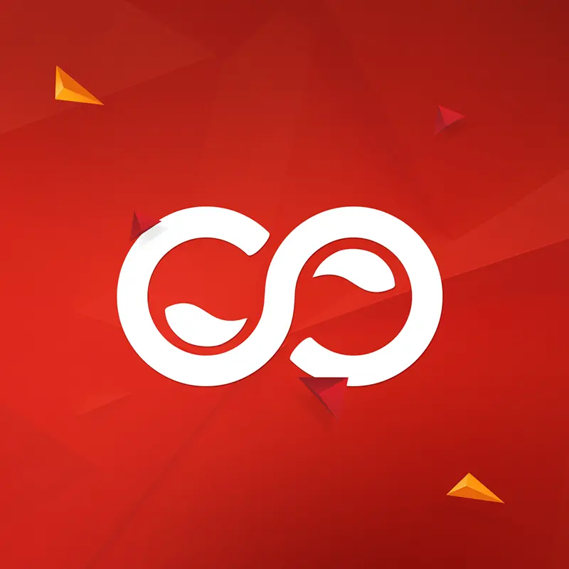
Amigo is a logo created for our client Training Amigo. We also designed the landing page design for this brand. Initially, we had the challenge to create a logo design and landing page design that serves the purpose, accumulating maximum benefit to the business. After understanding the motive, our designers came up with a logo that resembles wellness for the modern workforce.
You can see that the Amigo logo is inspired by togetherness and wellbeing, precisely targeting the employees for today’s age. Our designers were quite confident to create a logo that can easily connect with health and wellness much needed by the modern labor pool. After discussing with the client, we finalized three colors – orange, blue and green for the logo. Lastly, we created a font style that successfully fulfilled the client’s requirement.
In the next step, we started designing the landing page for Amigo. At first, we made the sketch for the landing page to be approved by the client. The illustrations were made keeping in mind the core objective of the business. The client was happy to approve the designs and after that, we’re all set to illustrate the sketches to design a powerful landing page.
During the entire process, our key focus was to bring out the best to perfectly match the need for efficient wellbeing and recognition software.