Project Brief
Juicy Pro is a beverage company that approached Rabbixel to revamp its packaging design. The company wanted a design that would stand out on shelves, grab customer attention, and highlight the quality and freshness of its products. The company wanted the design to be simple, yet eye-catching, and to appeal to a wide range of customers.
Our Approach
We started the project by conducting extensive research on the beverage industry, including the latest trends in packaging design. We also analyzed the target audience of the company to better understand their preferences and buying habits. Based on our research, we developed several design concepts and presented them to the client.
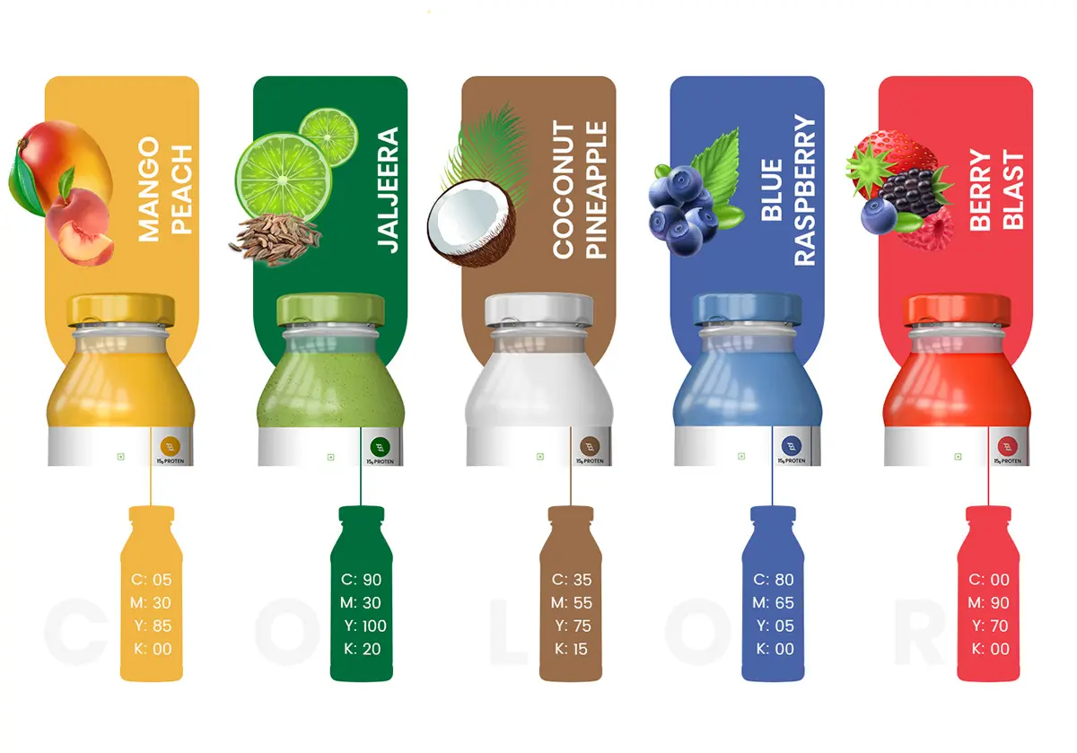
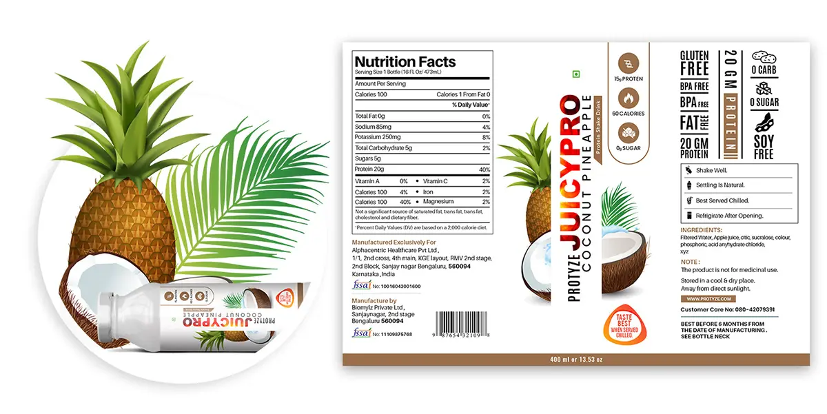
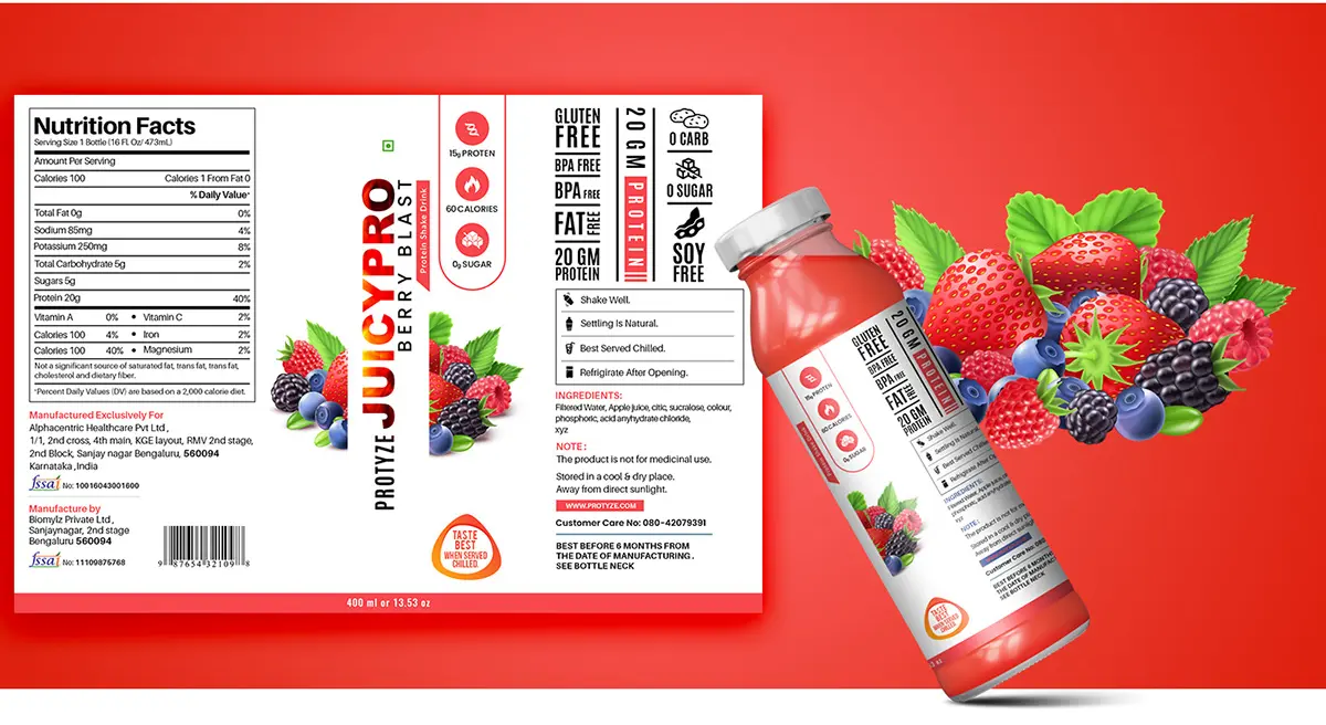
Our designers worked on incorporating elements of nature, such as fruits and leaves, in the design, as the company primarily focused on using natural ingredients. We ensured that the design was not only visually appealing but also communicated the essence of the brand.
The Solution
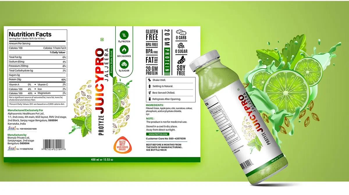
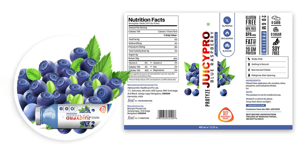
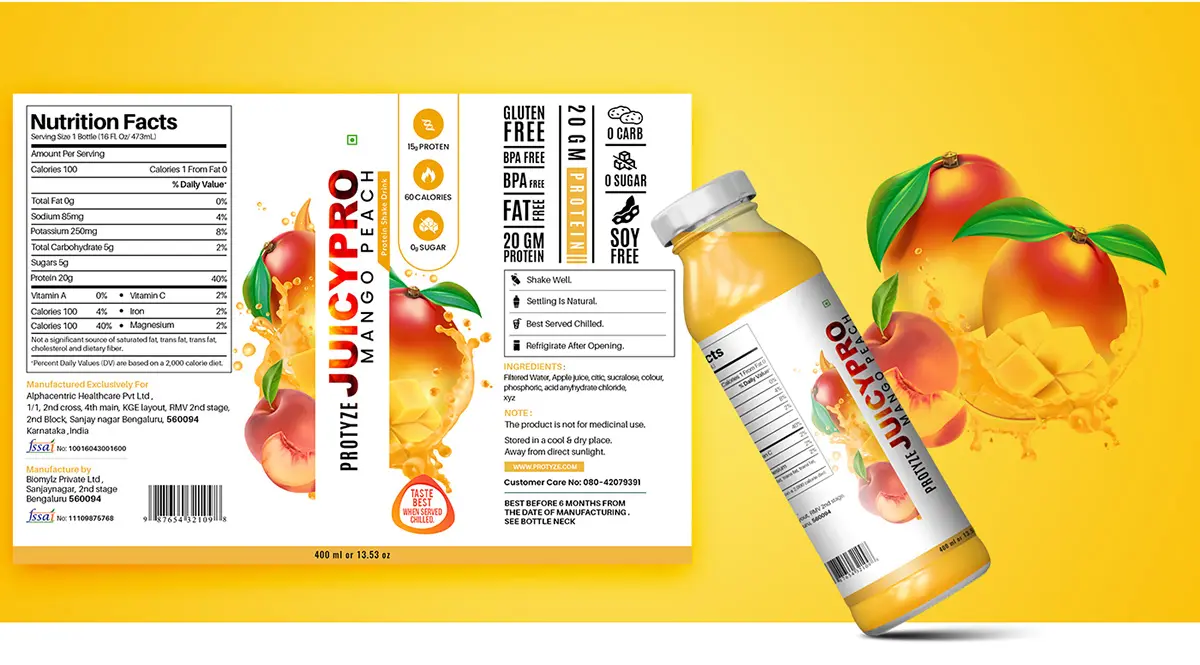
After several iterations and client feedback, we finalized a design that featured a bright, colorful, and modern look. The design featured a simple yet attractive logo with bold fonts and a unique color scheme. We also included high-quality images of the fruits used in the beverages on the packaging, which added to the freshness and naturalness of the brand.
Human Experience
The new packaging design created a positive impact on Juicy Pro’s brand. The eye-catching design and natural imagery created a fresh and exciting look for the products. The company saw a significant increase in sales after launching the new packaging, with customers appreciating the design and quality of the products. The packaging helped to distinguish the brand from competitors and helped to attract new customers.
Share on

